 |
| Pattern I use to create the back ground and inside the snow globe. Using the star tool and pen too to created snowflakes and stars. |
Friday, December 17, 2010
Final Happy Holliday
Thursday, December 9, 2010
Tuesday, November 30, 2010
Tuesday, November 16, 2010
Friday, November 12, 2010
Friday, November 5, 2010
Wednesday, October 27, 2010
Expression
 |
| Explanation: The typefaces matching what it most important to me in my life, and to represent the start of a message. On the top, the words is how I label myself as being. The gradient grow from inside to out mean I'm growing more and more as time pass. The pattern of checkerboard on the background transparent is because it represent all the choices in my life. The X,O, Triangle and Square represent I'm a gamer, the symbol is from PlayStation. The source of me being happy is down bottom being a boyfriend, that is why it bold and center point of the picture. There is happy on the right side going down as there are words beside first letter. There black and white is on because it my favorite color, and why the picture the way is it. The way gamer and geek touch in each other because they match, and Wii under it is how peoples say my name sometimes. |
Tuesday, October 19, 2010
Thursday, October 14, 2010
Wednesday, October 6, 2010
Vector Image
 |
| This was a very fun assignment, there were barely confusing but Illustrator did not have the text. What I did was to type the word then use paint brush grunge brushes to get it like that. Then group them together and set them to the back because the brush wont show on the image. |
Friday, October 1, 2010
Playstation Logo
 |
| While doing this logo the first struggle I have problems with is trying to turn so a shape to a degrees of the S. In the end I decide to use pen tool in order to make the S shape and the P shape. I learn when doing this was the pen tool was very good at creating shape that need to be created. |
Wednesday, September 29, 2010
Friday, September 24, 2010
Own Quote Edit
 |
| The "evil ways" is smaller so it won't distract the sentence. The color is still the same "evil ways" is red because it represent chaos, while "his enemy or foe" is blue is the opposite of red. |
Monday, September 13, 2010
Thursday, September 9, 2010
Text Illusrator
Thursday, September 2, 2010
Elements of Design
 |
| The color is the different color on the feathers of the bird. The principle of emphasis is the focus on the color of the bird. |
 |
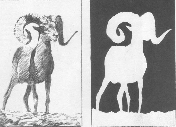
| The shape is negative the art is around the goat. |
 |
| The value of this picture is up is white and down below is dark, where the light hit it gray. The Principle of balance by they the informal balance there is nothing the same. |
 |
| The horizontal line separate the land from the mountain give the farm field calmness, stability and tranquility. The principles of proportion is the farmer in her big farm. |
 | |
| The principle of unity is all the part on the beach is blanch and unite to fit together. The direction that separate the beach and land is curve. The direction of the curved beach give it a restful. |
Wednesday, August 25, 2010
Huy Phan- Bio
Welcome to my Blog
This summer I went to Houston for 2 weeks to enjoy times with my families. The rest of the summer I stay home and relax, also do my summer reading assignment. I'm the only child in my family, I have 2 dads. I like to play games when i have and play tennis with my friends. My personality color is gold but my favorite color is black. I'm looking forward to this school year is doing good in school and to have times with my friends.
This summer I went to Houston for 2 weeks to enjoy times with my families. The rest of the summer I stay home and relax, also do my summer reading assignment. I'm the only child in my family, I have 2 dads. I like to play games when i have and play tennis with my friends. My personality color is gold but my favorite color is black. I'm looking forward to this school year is doing good in school and to have times with my friends.
Subscribe to:
Comments (Atom)


